Friday, 25 May 2012

Final Top Banner Buttons

The buttons for the top banner are now all completed and we are happy with the outcome. They will appear as black and white having the look of a sketched drawing, when the user rolls over they will grow larger and when clicked on the buttons change to colour.  I have produced the working buttons in Adobe Flash.
Home
Image BankSave
Facebook/Twitter
Assistance

Information


Tuesday, 22 May 2012

Button Alterations

The buttons for undo and redo have been altered to look more like an 'undo' and 'redo' button rather than just a right and left arrow.  I kept in mid the sketch effect look whilst re-designing them and create the new buttons shown below using Adobe Photoshop.

I decided that the buttons would look a lot better on there own without a circle around them like previously.

Another alteration made was on the Facebook/Twitter button in which the decision was made to have it in black and white like the others.  
This now fits in with the other content and doesn't look out of place, though the facebook logo is much darker than the twitter logo so this will be altered as together both are much darker than the other buttons on the page.
The logos are now much lighter and appear much better on the page with the other buttons.


Sunday, 20 May 2012

The top and side banners needed to be separated from the main interactive area where the users would draw, now to do this I had originally used just a basic line though I thought this looked out of place slightly with the other content having a drawn/sketched look about them.  This prompted me to look at the various brushes within Photoshop to see if I could produce a roughly draw line that would fit in with the theme I was attempting to create.  I tried many different styles but chose to use the brush named 'hard pastel on canvas'  thought this gave the best effect and look.
 Used to separate main interactive area.

I thought the brush worked well so I decided to use this to produce the buttons for the image bank sections.  Users will use the buttons to navigate to the image bank of drawings they wish to view.


Friday, 18 May 2012

Tools

The next thing I had to do now that the buttons were created was to produce the tools that the users will need to draw.
The tools have changed throughout the weeks in their appearance having being altered till myself and Tim are completely happy with them.  Below is the work that I have produced using a combination of the software packages Illustrator and Photoshop.  Tools have changed to show consistency throughout the website on all the buttons and tools that will be used.  

The brush starts off simple and has progressed to represent a tool that could be used on a drawing package but as a group we felt that the tools should have the same sketchy look and feel as the buttons do, so this is why it has evolved over the weeks and finish with the bottom one.

The pencil design again started out with quite a simple look which I wanted to improve upon and create a 3D look which I think came across very well but as a group we decided that it looked out of place with the buttons having the look of a sketch effect which worked well with what the site was about.


The crayon tool had the same treatment as the others in the fact that it has altered through the weeks going from a simple to a 3D look then a sketch effect design to be consistent with the other tools.


I designed a paint tin that would be used for the fill tool.  A simple drawn tin in Illustrator turned into a 3D tin then the finished tool looks like all the others with the sketch effect.

A felt tip tool was designed in Illustrator but we made the decision that the tool would not be included as we only needed the three, pencil, crayon and paint brush.

 Felt tip tool.


All the above tools will be in the panel situated on the left hand side of the site where the user will choose how what to use when creating their drawings.  The other tools that need to be produced are the colour palette and the line width tool.
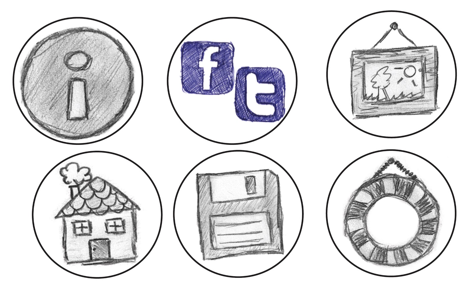

Wednesday, 16 May 2012

Buttons for the left panel

The buttons required for the left panel were undo, redo and clear.  Now like the previous buttons created for the top banner I wanted to continue the theme of the sketch effect buttons, so I drew the designs free hand and scanned them into the computer.  A circle was again placed around the design to portray the effect of a button.

Tuesday, 15 May 2012

Buttons for the top banner

In our meetings we had made a decision on the different sections that we would incorporate within the product.  This now allowed me to design and produce the buttons for these sections.
A button needed to be designed for the following sections that would be accessible from the top banner of the site : Home - Image Bank - Save - Facebook - Twitter - Information - Assistance.

My first attempt on the save, info and assistance buttons:


The style that I wanted to portray was one that could be associated with the product in the style it had been produced.  A sketchy look would suit the site and what it was about so I started again on the buttons and attempted to be consistent throughout on the creation of all the buttons.
The buttons below I sketched by freehand and scanned them into the computer,  cleaning them up using Adobe Photoshop and placing a circle around them.  


I feel the buttons relate more to the product with the sketch effect they have rather than being perfect.  It is a drawing/sketch application that we are producing and these buttons co-inside with the product.  The Facebook and Twitter button has been combined though this may change and the colour maybe also be altered to continue the black and white look. 


Friday, 11 May 2012

Logo

The logo is an important part of the product giving the user an impression of what the product would be, it was designed in Adobe Illustrator and Photoshop.
Here are some rough designs that I worked on to see what would look and work best for the product.


Below is the initial design of the logo:
I liked the effect of lettering giving it a sketchy look though felt it lacked the desired style we were looking for, wanting the user to be drawn in by catching their eye.  The font used is called Sketchy and was downloaded from the website DaFont.

Second attempt of the logo:

This logo was created in Adobe Illustrator using the brush tool as I wanted a sketchy feel to it and I think it has that effect.  The idea to incorporate a kind of face within the logo was to provide a look of friendliness to users, with our target audience being children.

Third attempt of the logo:


I used the initial font style (Sketchy) but incorporated the idea of the face within the logo.  The logo provides a sketchy look with the user being welcomed with a friendly face.

I will look into producing an animation with the logo so that maybe when the user hovers over the logo the eyes move.